Our media product is a 5 minute short film. A short film is an original motion picture which ranges of length but always shorter than 40 minutes, they contain some of the most inventive and unconventional work to be found in film making. Despite this, there are some common features among them which I will discuss in order to compare and evaluate our work:
- Narrative
- Characterisation
- Camerawork
- Sound
- Mise en scene
- use of genre conventions
- themes and issues
- Editing/post production
In order to complete our media product and ancillary tasks (the poster and film review) we underwent thorough research, analysing other media products to create understanding of the conventions of these products, providing guidance as to how I can apply these conventions to my own work.
Narrative organisation
Due to the reduced length of a short film the narrative has significant differences to the ordinary film, the complexity of the plot is often decreased and evolving around one main issue or event, instead of many. This is so all the relevant detail is included to create a full story (beginning, middle and end) surrounding this main occurrence.
This simpler storyline is then built on to be made as enticing as possible, rather than creating difficulty creating a complex narrative, which is impossible to follow compressed into the time space of 5 minutes.
Much of my research demonstrates that the majority of short films follow a simpler linear narrative, however my short film differs to this 'norm' having both a multi strand and a circular plot, being significantly more complex.
 |
| Beginning Middle End |
'Open skies' by Rob Brown is a prime example of the average short film, the events occur in chronological order with the young boy going missing. The simple narrative evolving around one main event is followed, also demonstrating the linear plot.
 |
| 9 frames representing narrative in 'False Witness' |
My short film 'False Witness' demonstrates the more complex narrative; both the opening and final scenes are at the graveyard, they are the same and follow on from one another linking the whole story together, making the plot circular.
The reasoning behind this was that in the final scene, more was discovered, as after becoming more aware about the character Rebecca, throughout the short film, the audience discover she is in fact watching the grieving mother at the graveyard the whole time, positioned behind a tree.
Also, throughout the short film, flashbacks are used parallel to the interview scene to demonstrate what 'really' happened and what Rebecca says happened, contrasting these different points of view, these represent the multi strand element of the plot as the event is shown from more than one perspective.
However, similar to 'open skies' 'false witness' evolves around a single event, the murder of a girl executed by her 'best friend'.
Another element of narrative is the amount of characters that the plot follows in a short film. In the ordinary film it is common to follow many characters as there is enough time to demonstrate detail on their background and how they relate to the story, however short films tend to follow just one or two characters in order to have enough time to elaborate the character on more than two actors.
 |
| Main character in False Witness, Rebecca |
 |
| Main character in Open Skies, the mother |
'False Witness' follows one main character Rebecca with other characters involved in the plot but not of as much significance.
'Open Skies' is the same following the mother throughout the short film, following the emotional change.
My short films story followed the stages of Todorov's theory primarily, but it was disorganised with the stage of confrontation occurring before the disruption instead, also the resolution was a resolution to the character Rebecca, although it was not the justice deserved and resulted in a criminal being freed, so could be interpreted as further disruption.
 |
| Equilibrium- Grieving mother at graveyard |
 |
| Confrontation- Rebecca being questioned/interviewed on the events leading up to her friends death |
 |
Disruption- Rebecca being shown to be the cause of Louise's death
 |
| Resolution- Rebecca being released |
 |
| New equilibrium- Mother at graveyard in fact joined by Rebecca as if she is out to kill again??? |
Whereas in Open Skies the narrative was restricted as the audience only saw what the mother saw, the son going missing, if the audience was to know the son's perspective also and why he went missing then the narrative would be otherwise.
There were difference in the plot and the story, as it would be impossible to fit every detail of a story into 5 minutes. This is similar to almost every short film. Bordwell and Thompson designed this theory,
The story was that the character Rebecca had been accused and also held for her friend Louise's death, Lousie's mother had accused her, resulting in Rebecca being held for something she persists she didn't do.
The plot only showed the interview resulting in Rebecca's release, the character leaving the premises, the bullying scenes leading up to the murder, and the murder itself.
This element is vital for exhibiting how the character is perceived by the audience, therefore creating certain feelings towards the character from the very beginning. The representation of the character is built up through the key elements of a film including camera work, sound and mise en scene.
In 'Sticks and Stones' the story follows a young girls road to suicide, the girl is portrayed through a range of shots to be lonely, isolated and depressed. The use of non-diegetic narration tin the form of a voice over, portrays the girls emotional position in words, as she describes why she is feeling this way, the sound works together with the image to create a morbid atmosphere.
 |
| In this MCU the girls expression is conveyed as she gazes bleakly into the distance, a watermark is left on her face as if she'd been crying, her costume suggests she is a smart schoolgirl who wears her uniform properly, perhaps not fitting in with the 'cool kids' who break the rules with shorter ties and un-tucked shirts. |
 |
| This ELS show the body language of the girl being crouched over, suggesting she has low confidence, her isolation is also represented here with her being alone shown as just a small figure in this vast landscape. |
 |
| The depth of field shows the outline of the girl in the foreground watching the children play in the background, this also shows her isolation as she is alone rather than with others her age, without friends. |
 |
| The use of lighting creates a silhouette effect of the girl alone sitting in a dark room, suggests her loneliness through the use of a back light.
Similar to the victim in this short film, Louise in 'False Witness' is portrayed to also be the victim of bullying.
|
 |
| The body language, having her head in her hands as she receives discriminating letters. |
 |
| An image showing Louise being forced to drink alcohol by her 'friend' against the dialogue of Rebecca saying the opposite, represents the lies Rebecca is telling showing she is the villain, and Louise the innocent |
 |
| A birds eye view shot makes Louise appear small and looked down upon by her killer as this is a perspective shot from Rebecca's point of view at the top of the stairs |
Rebecca the character represented as the villain has the opposite representation contrasting the good vs. evil following levi strauss' binary opposites theory.
 |
| ECU with low key lighting of Rebecca's eyes suggest her dishonesty as she looks towards the camera, then away from it after making a statement to the interviewer |
 |
| Costume dressed in dark clothing and hood up, suggest she is a suspicious character, also the composition of the shot, with Rebecca place behind bushes as if hiding.. |
 |
| Low angle shot shows her superiority |
Camera work
Camera work is used to portray the image in a certain way, using different shots angles and movements. This may be used to create an action code or enigma code following Roland and Barthes theory. Focus on particular objects or close ups may represent important signifiers for these codes or just simply emphasise the importance of certain shots.
For example in my short film we used an ECU to of the note attached to the flowers in the opening scene, this was to indicate who the character was (the victims mother).

In 'Mud boy' there were various action codes created, the use of shots emphasising the significance of the spade.
 |
| This shot is just before the girl discovers the body, the background is in focus with the face of the girl positioned in the handle of the spade, the depth of field in this shot is particularly effective involving both the tool and the character of which is to find the body, without them yet having any relationship. |
 |
| This shot is displayed in the opening shot of the title sequence, immediately showing the significance of this object. |
Camera shots can be used to display weakness or strength of characters, in 'False Witness' we used the shots in the flashback scene of Rebecca pushing Louise down the stairs to represent the contrast of weak vs. strong.
 |
| WEAK |
 |
| STRONG |
Establishing shots are commonly used as ELS to establish the setting of the film or particular scenes often used as the opening shot of a short film (see below).
 |
| Establishing shot in 'False Witness' |
 | |
|

 Close ups of characters convey their emotion and possibly personality.
 |
| Similar to the shots handheld shots used throughout the short film 'Leave me alone' (below), we used a handheld camera in this shot at the end of our film (above). We did this in order to indicate the presence of Rebecca in this scene, it is a point of view shot, as if she was holding the camera. |

Sound
Sound may or may not match the image, this is known as parallel or contrapuntal (example video of contrapuntal sound to the right).
Sound in short films come in two forms: non-diegetic and diegetic and can be used to create different atmospheres, it can create tension by increasing in pace, pitch or simply by increasing the volume.
Foleys can be created to match the image, these are the creating of sound effects by using objects off-screen, with a variety of props.
Below is a video of us creating the potential foley for Rebecca's fall down the stairs using a bag.
A non-diegetic soundtrack was used throughout the short film which we put together on 'garageband'. We used a mellow piano tune to begin with which muted when the dialogue began. The piano emphasised the sadness of the opening scene showing a grieving mother placing flowers at her child's grave.
The soundtrack continued with eerie high-pitched sounds to create an uneasy atmosphere, suggesting the objective of the short film surrounding the event of a murder and also its crime/thriller genre. During the final scene there is a significant increase in volume as the twist of the ending reveals Rebecca is watching the mother, this builds tension as the audience is left on a cliff-hanger wondering what is to happen next.
In parts of the film we used narration to explain the image, this technique was used to both save time and create variety. This was used in a few scenes, for example when Rebecca was describing certain events to the interviewer falsely, whilst on screen is how the event really happened. Also towards the ending when Rebecca is released and the Interviewer is describing why off-screen.
This narration is similar to that used in Stick and Stones, as it is the characters talking off screen over different image.
Here is a video of me recording the actress playing Rebecca to insert into the short film over the image.
This element is a combination of:
- Lighting
- Costume
- Makeup
- Props
- Facial expression and Body Language
We used lighting to portray the negative atmosphere in the short film, following the conventions of having high key lighting when there is happiness, and low key lighting representing depression, negativity and evil.
 |
| LIGHT SOURCE -----> |

In the shots in the Interview scene we used the effect of lighting to our advantage to show the character of Rebecca, the low key lighting resulted in half her face being unlit and shadowed, this lighting was also used in the thriller/horror short film 'Leave me alone', the lighting technique here created a mysterious feel as you could not quite see everything happening so the audience were intrigued to understand.
 |
| Low key lighting in 'false witness' |
 |
| Low key lighting in 'Leave me alone' |

We transformed Mae into the interviewer who was supposed to be played by the drama teacher at college. However she was unable to make the day set for filming so we improvised dressing Mae in a smart outfit with a blazer, knee length skirt, formal shoes, shirt and glasses, also the broach suggested she was of an older generation.
By tying her hair back and wearing subtle make-up with red lipstick, this suggested the formality of the interview.


In order to make Phoebe into the character Rebecca we dressed her in dark clothing, the colours indicating her dark character.
Purposefully we made Rebecca's outfits have less femininity, also wearing a hoody suggests she is similar to those who are stereotyped and associated with them negatively being criminals.


We changed the character Louise's outfits to indicate the change of time, seasons (wearing more/less), and showing how the bullying repeated itself daily as she went to college opening her books with new threat letters each day.

 Also by changing her hairstyle this made it more convincing to the audience.
Also we wanted the clothes to reflect the characters personality, the floral patterns, spotted shirt and high necked clothing, suggested her innocence.
Again showing the contrast between her and Rebecca reinforcing the binary oppositions theory.
In each setting we used a variety of props to make each setting convincing.
 |
| Setting props indicated the crime element of the genre, a 'POLICE' sign, a vertical pan shot highlighting the police lamp, and posters and leaflets on crime and the police pinned on the noticeboard provide information that the interview setting is at a place related to these (a police station). |
Hand props used by the actors included the substitute (using hp sauce and ketchup),a top, jewellery box, red wine, flowers, a vodka bottle and the threat letters (as shown below).
 |
 |
 |
Facial expression and body language

The 1st shot shows Rebecca looking at Louise after forcing her to drink alcohol, the facial expression having both a frown and smirk suggest she is mocking Louise.
The 2nd displays the glare as Rebecca plots to ruin Louise's top.
The 3rd shot shows the smirk as Rebecca is released without charge.
All of these facial expressions suggest the personality and emotion of this main character, all portraying her in a negative light.
These shots below contrast to the above, showing it from the victim's point of view, sadness, despair and hurt.
 |
| The body language suggests the mother is grieving, looking down at the grave with a dull, empty expression representing her emotional state of loss. |
 |
| The innocence of Louise is represented as he facial expression of disgust as she tries alcohol for the first time. |
The use of different facial expressions and body language make the audience empathise with the characters, they understand how they are feeling by what they show in the frame.
Use of genre conventions
Use of genre conventions
Short films are typically known to be a mixture of more than one genre and sub-genres, known as hybrids. 'False Witness' is a thriller primarily but has the sub-genre of crime, it is a hybrid of the two therefore involving conventions of both.
Steve Neale created a narrative theory which applies to film. It suggests every film attached to a genre follows repetition and difference of it. Repetition of the common conventions, the elements of a film which the genre's typical audience enjoy, and difference to make variety and broaden the genre making it more interesting and unpredictable to the audience.
False Witness uses many of the typical conventions to fit with its genre, and also those which make it differ, therefore following the theory.
The conventions we used:
A protagonist- the interviewer is involved in solving the case of the murder, however they are usually the main character in the crime genre and this suggests the 'difference' element in the Neales theory, also she results in being a neutral character as although isn't evil and in fact oblivious to the 'crime doer' she releases Rebecca, and therefore unsuccessful in her role.
A villain- Common in these genres, this bad character creates conflict and tension throughout a film. Rebecca is the obvious villain, she's also the main character.
Crime- This is what the crime sub-genre evolves around, an event and in our case the murder of Louise.
Setting- The police station suggests the crime element, often the setting in a thriller is mysterious and creepy, but in ours the place of crime was simply a 'normal' girls house.
Mirrors- These are often used in thrillers to reflect what the darkness within a character, the villain, they show things from more than one angle at the same time, emphasising on an event, such as the jewellery stealing scene in False Witness. Another shot using a mirror was where Rebecca was watching Louise slyly, the mirror emphasised her behaviour.
 |
| Rebecca Watching Louise Rebecca stealing from Louise |
Lighting- The lighting reflects genre by creating certain types of atmosphere, in this case low key lighting is effective in thrillers.
Music- Eerie, high pitched music is typical in thrillers, sometimes in fast pace at time of tension. False witness followed this with its non-diegetic sound having a high pitched, eerie feel however, it contained a piano, saddening the mood during the scenes of mourning.
A resolution- Often in crime films a resolution is expected at the end, the villain is caught after a game of 'cat and mouse' however false witness is unusual as the outcome is not what the audience wanted, the villain is let free to potentially kill again.
Flashbacks- These are used to display images of a different tense (normally the past), often used to show different points of view, memories and in crime/thrillers 'what really happened', this is exactly how we used the flashbacks in False witness, representing the truth of the events in the past, contrasting the scenes of lies in the interview room.
Themes and issues
False Witness involved a variety of themes and issues which were represented in the short film, some more realistic than others.
The storyline followed the murder of a teenage girl, committed by another, including flashback scenes following the build up to this event. This tackled the issue of Bullying, how what is seen as minor yet malicious events such as the writing of threat letters, stealing jewellery, ruining clothes, forcing to drink and exclusion from having other friends can lead to a significant event of a murder.
As well as this theme, crime and the issue of injustice is represented, a guilty female getting away with murder, by lying and playing innocent. Although this wasn't necessarily a realistic enough representation, it still arose the real-life issue which can occur when insignificant evidence is present.
The theme of age of the characters is present, the adolescent mind is interpreted by including normal events such as trying alcohol, choosing outfits to impress, and being included in friendship groups. The way Louise stated she was 'telling her mum' on Rebecca, indicated the dependence of Lousie on her mother, suggesting she is still at a dependable age where her mother is needed to help deal with her problems, and involved with her social relationships.
Editing/Post production
Poster- Ancillary Task 1
The purpose of a film is to advertise an upcoming film, posters are displayed in the public eye such as transport stations, cinemas and local noticeboards, this creates awareness of the film generating an audience. A film poster follows particular conventions, these are in order to provide the audience with information with both font and image. A poster is used to target a specific audience, this is through features indicating genre, characters and plot, as to which certain audiences prefer. The aim is to make them as engaging as possible to lure in the audience.
As short film posters aren't common I carried out lengthy research on ordinary film posters to create our own for 'False Witness. Research was vital to discover the common conventions and understand what works well.
The common conventions of a film poster:
In all the film posters I studied the title was in the largest font, so on our poster we followed this convention having a large title, made highly visible using opposing colours of white font and black background. We found the font on dafont it is known as 'Old Press'. We chose this eroded style with slightly slanted letters to representing the friendship of the girls, as if it's eroded away and not quite as pure as it seems.
Commonly on film posters with famous actors the actors name is the next size down from the title in font, this is due to the actor drawing in an audience as they already have an established fan-base. In addition to this, if the film is made by famous directors or producers their names are also likely to appear in a large font on the poster. However, due to our short film being produced by students with insignificant actors neither were named in large font but just displayed in the credit block instead.
A credit block is a legal element to a film poster, it is the small print and includes the information of all the people and companies importantly associated with the film, these are often displayed at the bottom of a poster (for example The Imposter), so therefore we decided to follow that convention.
A review is a common convention of a poster, is likely to involve a star rating. The Reviewer is likely to indicate the target audience of the film as certain audiences will trust, know and relate to certain companies. For example on the poster of Brighton rock, the reviewers were large newspapers such as 'The Times' and 'Daily Mail', suggesting the fan base of these will enjoy the film too. In our poster we used independent names, including a short film review company Little White Lies. The language used in the review also indicates the genre, for example words in thrillers like False witness using 'thrilling' and 'spine-tingling' differs to a rom-com which may use phrases like 'feel good film of the year' and 'absolutely hilarious'.
A tagline is a common element that many film posters have, we chose not to have one as we felt the reviews below the title were enough and didn't want to much text to draw the audience away from the image.
The poster involved a border which appeared to be a camera display screen, this was due to the same screen being used in the short film for a couple of interview shots, demonstrating the interview being filmed. This element of using the display screen as a border was used to link the two products together, relating one to the other.
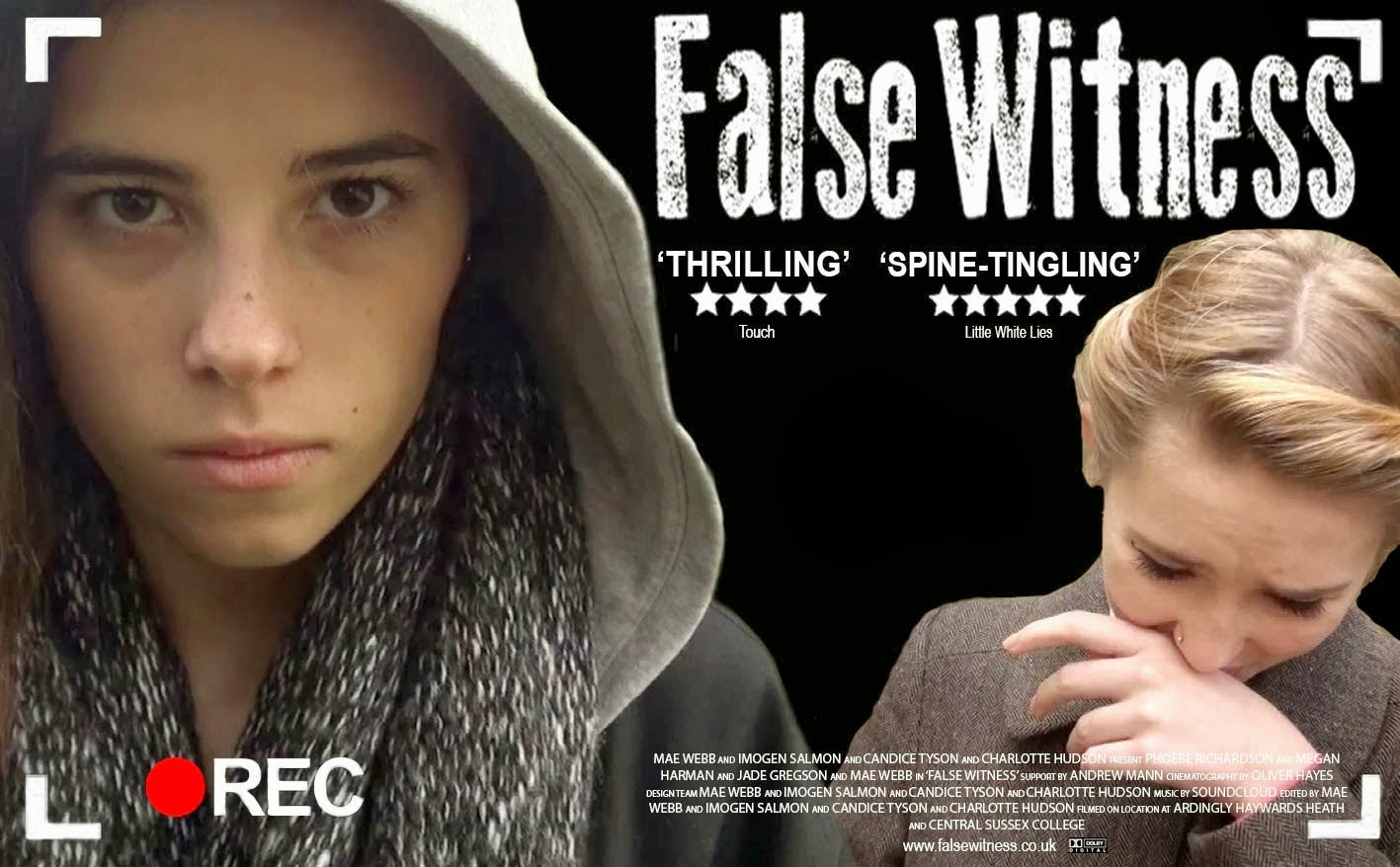
The main image involve a plain black background against two, Photoshopped, separate images of two characters of the film. The main character Rebecca was the largest image,taking up almost half of the poster. This shows her authority, and suggests her prime role in the film. The facial expression and direct address used, looking straight on as if at the audience and an evil, blunt look represents her dark character in the film. The image of victim Louise contrasts this completely, looking down with her hand covering her face suggests she is innocent and shy, the image is smaller in comparison also suggesting her weakness and less significant role being the victim.
From the research I discovered that many posters remain highly symmetrical, or with particular alignment, appearing neat and organised, in order to achieve this we aligned the title with the credit block and reviews. Dead space was used to create a distance between the two characters and we made sure the main image (especially the characters faces) were not covered.
The purpose of a film is to advertise an upcoming film, posters are displayed in the public eye such as transport stations, cinemas and local noticeboards, this creates awareness of the film generating an audience. A film poster follows particular conventions, these are in order to provide the audience with information with both font and image. A poster is used to target a specific audience, this is through features indicating genre, characters and plot, as to which certain audiences prefer. The aim is to make them as engaging as possible to lure in the audience.
As short film posters aren't common I carried out lengthy research on ordinary film posters to create our own for 'False Witness. Research was vital to discover the common conventions and understand what works well.
The common conventions of a film poster:
- Title
- Tagline
- Credit block
- Review/ Ratings
- Main Image
- Actors, directors and producers names
 |
| Here are the three posters I researched. |
 |
| The title |
 |
| Example of actor name font |
| Our credit block |
 |
| The imposter's credit block |
| Example review and rating from Brighton Rock |
 |
| Our review and rating |
| Example tagline from 'The Imposter' |
 |
| False Witness Final Poster |
 |
| Image from the film- Interview scene |
The main image involve a plain black background against two, Photoshopped, separate images of two characters of the film. The main character Rebecca was the largest image,taking up almost half of the poster. This shows her authority, and suggests her prime role in the film. The facial expression and direct address used, looking straight on as if at the audience and an evil, blunt look represents her dark character in the film. The image of victim Louise contrasts this completely, looking down with her hand covering her face suggests she is innocent and shy, the image is smaller in comparison also suggesting her weakness and less significant role being the victim.
From the research I discovered that many posters remain highly symmetrical, or with particular alignment, appearing neat and organised, in order to achieve this we aligned the title with the credit block and reviews. Dead space was used to create a distance between the two characters and we made sure the main image (especially the characters faces) were not covered.
Review- Ancillary Task 2
A film review is a text in which a person evaluates a film, including their personal opinion, identifying the genre, plot and characters. We chose our review to designed as if an article in short film review magazine, 'Little White Lies'. This was to make a realistic review. We used an exact replica of the review after analysing an example from the magazine 'A field in england', of which I analysed in order to reproduce.
 |
| My analysis of the layout of a LWL review |
 |
| My final Review |
Devices:
- Rhetorical Question - A statement posing a question without expecting an answer
- Metaphor - A figure of speech in which a word or phrase is applied to an object or action to which it is not literally applicable
- Adjective - A word describing a noun
- Adverb - A word modifying the meaning of a verb
- Complex Noun - Name of person, place, state, thing or quality
- Complex Sentences - Several points compressed into a single sentence, using complex language
- Restricted Code - Specialist language which assumes knowledge by the reader
- Pun - A play on words exploiting another meaning of a word or a word sounding alike
- Alliteration- Words following on another beggining with the same letter
- Rule of three- using three adjectives in a row
Examples In our review:
an intricate, complex and dark
trail of events- Rule of three
catastrophic consequences - Alliteration
‘green-eyed
monster’- Pun
having too many cooks could have made this a recipe for disaster.- Metaphor
deadly consequences- Adverb2. How effective is the combination of your main product and your ancillary tasks?
I believe that our media products of a short film, poster and review work effectively together to create a convincing real-life commercial text. Through good communication and organisation within the group I believe we worked well to create the final product 'False Witness'.
The ancillary tasks would be the advertisement for the film, they both evaluate and entice the target demographic into watching it. Before creating the product we needed to decide on our target audience to ensure the appeal to the right audience, maximising the ratings and reviews.
We decided on a mainly female audience between the ages of 15-25. After deciding this we could decide on the characters representation and the genre, ideal for the target audience.
Our main product is an independent, low budget short film it would not have the same scale of advertisement as ordinary, feature length films have. Therefore rather than advertisement on billboards on buses an banners in town centres, we would use the internet on websites related to our target demographic aiming at mid teenagers to young adults by using our poster on these sites. Examples of these are social networking sites such as face book and twitter as most people of our target audience use these on a daily basis, also video sharing sites such as Youtube and Vimeo would also be ideal and of a very low cost. We could also display posters at bus shelters, small theatres and cinemas which are more likely to show short films than larger organisations like the ODEON cinema.
In addition to this displaying our final short film at festivals which are full of short film enthusiasts, these screenings are aimed to engage in those interested in this area of film making, an example of a UK festival is Raindance. These methods are realistic for our particular form of media product.
As the poster was of our own design and template we used every element possible to relate to the film. For example the font was the same on the poster as in the credits and title sequence in the opening of our short film, linking the two together. This method was used to begin making a brand of the font so it is recognisable to False Witness even without any image. An example of this is the film Love actually, using the same colour and font for the text of the title on the opening sequence and poster, it becomes a product of advertisement.
By using particular images of the characters both on our poster and review, we represented the characters a certain way, in order to represent the film as a whole itself. We did this by using actual images from the film, to give an accurate representation. The images were both character focused, suggesting they are the main roles and an important element to the film. We chose carefully through a variety images narrowing them down through many drafts to create the correct portrayal of characters, finally deciding on two images of the both villain and victime characters in role, edited together and on the review a simple screengrab of an ECU of the villain's eyes.
I believe this correctly referred to the genre of crime-thriller using two contrasting characters of good and evil on the poster, and the review using an ECU of staring eyes creating an immediately chilling image.
Our review is based on Little White Lies, a bi-monthly British independent film magazine. Although it is aimed at a slightly older demographic of 25-35 year old males, the readers are often experienced short film enthusiasts, and would be interested in a new product even if aimed at a younger audience.
Mimicking the style of Little White Lies, I feel our review is effective as it effectively included all the correct features, the article was displayed in three equal columns using a particular font, 'aparijita', the titling, drop capitals and rating numbers were in Century Gothic. The layout was very precise with an image at the top, particular dimensions, font size, spacing and order which we followed carefully.
The language used in the review also mimicked the style of that in Little white lies, including metaphors, puns, adjectives and generally complex language.
In order to not give too much of the plot away (the death of Louise in particular), we had to choose the language used in the reviews to suggest catastrophic events but not give away the film. Also we decided not to use a particular image which was used in one of the draft posters, this was due to the fact the image being that of the fall where Louise lies in a pool of blood. We felt this gave too much of the plot away and a simple close up of both characters would be more appropriate for the poster.
3. What have you learned from your audience feedback?
 Our target audience for our media product 'False Witness' is mainly female 15-25 year olds. Due to all characters being female in the film and none intentionally represented in a sexual way or as eye candy to appeal to males we decided the majority of the audience are likely to be female. Although we did receive positive feedback from the male audience, such as Leon, Will and Richard, I believe this is due to the thriller/crime genre which is popular with males.
The age of the characters suggests the audience ages as they are adolescents and deals with the everyday issues of bullying and jealousy common in this age group, therefore our chosen age of the audience can relate to this better if they are of a similar age or can relate too in the not too distant past.
I collected feedback through our groups email asking people a variety of open ended questions about the short film and poster, specifically requesting constructive criticism as well as compliments so it can help me to evaluate my products.
To improve I should have ensured that I received feedback throughout the whole process of creating our media products, rather than after, this would ensure we could have made some of the changes suggested rather than realising them after. In the 'real film' world this is used to alter films in order to improve in various ways, this may be to please the audience as in Pretty Women a 1990 Rom-com where the audience preferred a happy romantic ending to a sad one.
To improve I should have ensured that I received feedback throughout the whole process of creating our media products, rather than after, this would ensure we could have made some of the changes suggested rather than realising them after. In the 'real film' world this is used to alter films in order to improve in various ways, this may be to please the audience as in Pretty Women a 1990 Rom-com where the audience preferred a happy romantic ending to a sad one.

Here were the responses:
From these I learnt that we could have made parts of the film clearer. For example the graveyard scene was commented on that the audience were left unsure as to its relevance as weren't given enough indication of the women being the motherly figure. To improve this I think we should have involved her during the scene of the fall, and used an older actor, also having more emphasis on the note 'miss you, mum x' by increasing the length of the shot would have helped on building the motherly character into the film. I believe the reason we had difficulty with this factor was the strict time limit of 5 minuter of which we had already exceeded by about 20 seconds and we were highly aware of keeping this down to a minimum.


Another criticism which I took into account was the relevance of statements used on the reviews on the posters, whether they truly fitted the film? This could have been improved by making a wider variety to narrow down, by having more effective planning in the build up to creating the final poster.
Another addition to the poster suggested by Martha (above) is that we could have used a tagline e.g. 'jealousy can push you over the edge'. I think this was a good suggestion as a tagline is a convention of many film posters, and not only would it make ours more convincing but more effective at suggesting a theme of the film- jealousy.
 |

Using Face book I set a status in order to gain feedback to create the ratings (for the review) and receive comments of feedback:

Here is a link to the post i made working out the review ratings- http://advancedportfolio201361.blogspot.co.uk/2013/12/audience-feedback-imogen-salmon.html

This feedback suggested we used more close ups of emotion of the mothers face, I agree with this thinking we could have ensured that the actor was able to cry during the scene, so perhaps choosing someone more comfortable around us?

These comments continue to suggest how we could have improved the graveyard scene to suggest (even more) that Rebecca is free to kill again.


The process of creating our poster began by creating an initial draft each. We then followed up two posters, improving them both. Then after receiving feedback we altered these posters and merged them together using factors of each. From the feedback we learnt more technical conventions of posters, including the particular alignment of features and the carefully selected image
 |
| Draft 1 |
 |
| Draft 2 |
 |
| Draft 3 (follow up) |
 |
| Draft 4 (follow up) |
 |
| Final Product |
Writing the review involved receiving feedback from our teacher. He commented on each of our drafts, which was helpful as it taught us how to create a professionally written review using the correct language and paragraph structure.
 |
| 1st draft |
 |
| 2nd draft |
 |
| Final draft |
 |
| Final Review |
Youtube is also useful to gain feedback from our short films- the public may add comments (which they haven't yet) and like/dislike the video upload (we have 3 likes and 0 dislikes).


4. How did you use new media technologies in the construction, and research, planning and evaluation stages?
Sorry, will look at your evaluation tomorrow I hope. Sunday 26th.
ReplyDeleteYou can apply Todorov to the story, but not to the plot. He can be applied to linear plots.
ReplyDeleteCharacterisation - voice over is non diegetic, technical codes also includes editing,
Overall a good review of the film.
Poster - this is successful - you integrate actual film posters and your own well.
Good on the review, you are one of the few to consider language conventions as well. This needs elaborating further - consider the paragraph functions as well and the wider reasons as to why it is written in this style - whi is LWL target audience - a very film literate , mature well educated audience - hence it is written in a style to connect with them.
Video for Q2 does not work. Perhaps discuss , as a parallel, just what a blockbuster would do and provide examples in your presentation. As you say you don't have these facilities available. remember last year we looked at how independent films were using x box to promote indepencdne films - see link - could be worth discussing.
http://www.telegraph.co.uk/technology/video-games/Xbox/9906973/Pulp-becomes-first-film-premiered-on-Xbox.html
Any idea as to the costs of some of these placements?
Make the connection between the language style of LWL and the TA of that magazine.
Overall Q2 seems good, but I can only read it. If your video is stimulating, not just you sitting in front of a camera, and has imagery of the texts and ideas that you refer to, this will be a v. good answer.
Q3 - Good comments on the film and reflection by you. However be upfront that this feedback is really coming too late and is done after the film is completed. What should you have done was to gather feedback as you went along. Thgis is what happens in the real film world and you can see if you can find any examples of where different ending have been made or major overhauls made where a film has been perceived as not working.
You have used feedback correctly in the making of your poster and review.
Q4 is progressing nicely - the prezi will allow you to embed lots and lots of images and video. Its a great presentation skill. Your text looks suitably reflective.
Overall, looking good. Already a lot of work here. I am curious as to how Q2 will LOOK - is it going to be an all bells and whistles or is it more pedestrian with you just talking to a camera. It would be worth your while integrating imagery t illustrate the good points you make. Go for 20 out of 20 - takes the pressure of later.
Imogen - your video is saying that it is for private use only - think you should talkk to technician.
ReplyDeleteQ2 - the transcript reads well Imogen. Couple of things for you :-
ReplyDeletea) You chose the images - how do they work as portrayals of Victim and Villain. This also illustrates Levi Strauss re Binary Opposites. Think about the iconography of the thriller - CU camerawork and MeS - facial expressions etc etc.
You need more on LWL - this is targetting a different audience , however it will add to the genteral buzz of the film should it get a favourable review. Provide exampoles of how it does this.
Well done its looking good as a whole - you are going to be pretty near full marks. Its a great achievment. You should be proud of yourself.
prezzi also looking good. The only suggestions i can make is to have a few more ads or disads illustrtaed by your actual work - a photo that you manipulated through photoshop for example - before and after type thing.
ReplyDeleteWell done again.
Imogen - the video for Q2 is excellent. No worries.
ReplyDelete