Due to audience feedback on our casting of the character Louise's mother not being convincing we have made a slight change to our film. We have changed the character to Louise's sister as she fits the age better, we did this by editing the shot of the note on the flowers to just say 'Miss you x' rather than 'miss you, mum x' and also recorded a voice over of our character saying 'miss you sis' to further suggest to the audience the significance of this character, Louise's sister. We feel this makes our film less confusing and more convincing to the audience as our actor was too young to be playing her mother.
POSTER
We have made a change to one of the reviews, changing it to 'Time Out' as this is more upmarket and appropriate for our audience.
REVIEW
We have changed our review slightly by aligning our text up to the same place and made our drop capital at the beginning fit with the text by reducing its font size from 12 to 10.
1. In what ways does your media product use, develop or challenge forms and conventions of real media products? We have produced a 5 minute short film called 'False Witness', a film poster and a film review in which we have used, developed and challenged forms and conventions of real media products.
a) The short film
Here is our final film:
Before creating our film, we had to undergo a lot of research into other shorts films as they are quite different to feature length films. Although all short films are unique in their own way, there are common conventions that they all share:
Narrative organisation & short film format
Camerawork
Sound
Editing/post production
Mise En Scene
Use of genre conventions
Themes and Issues
Narrative organisation & short film format
In most short films they
follow a simple, linear narrative because of the short time that the
plot has to be shown in. However, we challenged this convention and
decided to make our narrative structure more complicated. We used both a
circular and multi-strand to be able to show two contradictory events.
Our narrative is also non-linear as we jump back and forth between the
past and the present through the use of flashbacks.
Circular narrative
Multi-strand narrative
The filmLovefield is an example of a simple, linear narrative as it follows in chronological order and goes from beginning, middle to end. Although restricted narration is used to make us believe one thing which is the opposite to what is actually happening.
Beginning Middle End
We used the circular plot to tie together the events of the story and leave the audience feeling tense. The opening sequence at the graveyard shows Louise's mother at a grave which is the present tense, this then leads on to a series of flashbacks showing the events that led up to this scene.
At the end of the film we
then return to the graveyard and in the present tense, however this time
the audience know what has happened and that Rebecca has been released.
A final tracking shot in the graveyard reveals that Rebecca was
actually watching the grieving mother, making the audience think that
she might be there to hurt the mother, giving a tense atmosphere and
leaving them wanting to find out more.
We used cross-cutting to
create our multi-strand plot showing the flashbacks of Louise and
Rebecca against the shots in the interview room. This was to show the
audience Rebecca's lies making them against her and seeing her as evil.
This also makes our narrative unrestricted as the audience know more
than the characters making them omniscient throughout. We chose to do
this to build suspense rather than to shock the audience, and make them
feel tense at the end of the film when Rebecca is released because they
know she is guilty.
'Never Forget' has a very similar narrative format to our film 'False
Witness' as the film switches between the present and flashbacks from the
past to reveal that the female character is lying to her fiancee. They cross-cut between the present showing the two characters talking on the phone, and the flashbacks. However, they also use parallel editing here to show that the two characters talking on the phone are happening simultaneously.
Screen Grabs from 'Never Forget' and 'False Witness' showing the multi-strand narrative through the use of flashbacks.
Bordwell and Thompson - Story and Plot
We used this theory to our advantage in the film to make the audience constantly on-edge and to reveal faults in the justice system. The story of the film is that Louise and Rebecca were best friends, and when she died by falling down the stairs Rebecca was accused of murder by Louise's mother but was released. However, in the plot it is revealed that, unknown to everyone else, Rebecca did actually kill her and we see her lying in her interview.
Levi Strauss - Binary Oppositions
We also used the binary oppositions of good and evil. We portrayed Louise as good in the film because of her naivety and innocence which was showing through her facial expressions and body language. For example, we often showed her looking quite hurt by the way she was being bullied and slightly scared when Rebecca was making her drink. She had very closed body language showing she is timid and unable to stick up for herself.
Rebecca is portrayed as evil because of her spiteful actions and lies. This is shown through her different facial expressions. For example, here she is shown looking spiteful towards Louise as she thinks about ruining her top, and also laughing at Louise after she makes her drink the alcohol.
Camera work
Camera work includes movement, angles, shot distances,depth of field and composition.All of these are used to portray characters in a certain way to the audience, show aspects of mise en scene, and reveal important parts of the story to the audience.
Shot Distance
We used Close Ups on Rebecca's face when she is lying to show when she is getting nervous as it makes the audience feel as though the walls are closing in on her and she might break. In the film 'Never Forget' they also use close ups on the woman's face when she is lying which reveals her guilty facial expression making her appear panicked as she is trying to think of what to say. However, in 'False Witness' the close ups of Rebecca reveal that she is fairly calm and looks confident about what she is saying. This portrays her as a manipulative and malicious character as she has already planned what she will say.
Screen grab of close up from 'Never Forget' and 'False Witness'
Establishing shots are a commonly used convention in any film to show the audience where the characters are which adds context to the film. We used an establishing shot as the opening of our film because we wanted to establish straight away that the character is in a gravyard and let the audience know that the film has a theme of death and prepare them for what is going to come.
Here are some examples of establishing shots from the films I researched:
Establishing shot from 'Lovefield' - sets the mood of a thriller as cornfields are a common setting for the thriller/horror genre films.
Establishing shot from 'About a girl' - shows their social class, the tower block suggests they are from a working class area.
Angles
Camera angles can be used to convey power and we used this in our film to represent Rebecca as strong and Louise as weak. For example in this shot we used a very low angle after Rebecca has pushed Louise down the stairs making her look dominant, powerful and in full control as she has just taken someone's life.
Very low angle of Rebecca
However in this shot we used an extreme long shot, birds eye view angle of Louise on the floor after she has been killed making her look very small in the frame, weak and helpless. These two angles work well together to show the sheer dominance that Rebecca has in their relationship.
Birds eye view angle of Louise
A similar very low angle is used in the film 'Lovefield' to make the male character seem powerful and dominant when we think he has just killed a woman. This is effective because it further makes the audience believe that he is an antagonist, therefore shocking them more when it turns out he is the opposite.
Movement
We used tracking a few times in the film to follow characters. One particular time we used it was when Rebecca is released from custody and we tracked back showing her smiling as she walked out of the police station. This makes her look powerful as the camera is moving away from her rather than following her. This also makes her look quite intimidating as she moves towards the camera with a confident walk and a smug facial expression.
Example of tracking shot in 'False Witness'
A similar tracking back shot is used in the film 'Nightwalking' to make the male character appear threatening and intimidating from the females perspective.
tracking shot from nightwalking
We also used another tracking shot at the end of the film to reveal that Rebecca was standing at the grave watching the mother. We purposely broke the 180 degree rule in this shot to slowly reveal Rebecca to the audience and shock them when they see her to end the film with them feeling tense as it looks like she may be there to harm Louise's mum.
example of tracking shot at the end of 'false witness' to reveal Rebecca
example of hand-held shot in false witness
We also used some hand-held shots to create mood in the film. For example, in this shot when Rebecca is re-telling the events that happened on Louise's death, we used a hand-held shot to show that she may be getting nervous because she know's she has to tell the events correctly. This makes the audience on-edge wondering if the interviewer will believe her or not.
Sound
Sound is a convention of a film that is very important in a film whether it's non-diegetic or diegetic sound. This is because it can add a certain mood to a film and it has the ability to make an audience feel a certain way about what is going to happen.
The non-diegetic soundtrack can be contrapuntal or parallel. Parallel is where the mood that the music creates fits the mood of the film, however contrapuntal is when it does not fit, for example showing a murder with happy music over the top. An example of how powerful the soundtrack can be is in Lovefield where the eerie diegetic sound makes the audience feel like something bad will happen, but it turns out to be a happy story.
We needed to think carefully about what mood we wanted to create in our film. At the beginning when the mother is in the graveyard we wanted the audience to feel sympathetic and emotional towards the mother, therefore we chose a slow piece of piano music for the non-diegetic sound.
We carried on this diegetic sound onto the next scene of the film in the interview room as a sound bridge to show that the two events are connected, however we wanted to make the rest of the film more eerie as the audience find how out the girl has died, therefore we added a high pitched, darker piece of music over the top to create a tense mood. We merged these pieces of music together using garage band.
We created Foley's for our film, in order to enhance some of the sounds in our film. For example the sound of Louise falling down the stairs. By doing this ourselves rather than finding a sound effect meant we could manipulate the volume more and create the sound we wanted. Here is a video of us experimenting with how to make this foley.
This use of foley's to enhance sound can be linked with the film 'Lovefield' which has many enhanced sounds to create mood. For example, the loud sound of the sign creaking and the crow.
Here is a video of foley artists creating these sounds to go with the actions of the film:
We used off-screen diegetic sound in the film as a sound bridge over certain flashbacks following on from what Rebecca is saying in the interview room. We did this to show the complete lies and contradiction from what Rebecca was saying to the interviewer and the truth we are shown. For example during the flashbacks of Rebecca forcing Louise to drink alcohol, we hear Rebecca say to the interviewer that "she started drinking before me". Here is a video of us recording this dialogue to use as a voice over.
Editing/post-production
We challenged the convention of a short film being a fairly simple plot as we included flashbacks in our film which is not very common considering there is only a short amount of time to tell the story. However, one other short film that I researched was 'Never Forget' which used flashbacks for the same purpose that we have, to show the audience that the character is lying.
The image above shows the flashback scene's in 'False Witness and 'Never Forget'. Never Forget did not use any transition into the flashback, and during the flashback jump cuts were also used, making the pace quite sudden and it doesn't give the audience too much time to see what is going on in the flashbacks, this creates a panicked mood as the female character is frantically trying to think of what to say as she is being questioned on the spot. Here is an example of where a jump cut is used in a flashback.
Example of fade to white in false witness
However, we took a slightly different approach to this in False Witness. For example, we used a fade to white transition between the flashbacks in order to show her mind thinking back, it also makes the transition more calm and controlled showing perhaps she has thought it all through before. We also used smooth cuts showing that she is not panicked at all and has planned her response in advanced showing her manipulative nature. In addition, the white fade is less sinister than a black fade, and almost resembles a dream like state, as if she is fantasising about it showing how evil and twisted she is.
We also used a graphic match at times to link scenes together. This shows the audience that Rebecca has emerged herself in what happened and remembers all of the details about what happened, making her straight up lies even more shocking. Here are screen shots of the graphic matches in False Witness:
Mise En Scene Mise en scene is an important aspect of any film as it is essentially what the audience see on the screen. This can be used to create a certain genre, and portray characters in certain ways. The aspects of this we focused on for our film was :
Lighting
Facial expression & body language
Costume & makeup
Lighting
We used lighting in our film to create a dark, negative atmosphere. This is a common convention in most thrillers/horrors as it adds to the mood.
We used low-key lighting in the interview shots, and made it so that half of Rebecca's face was in darkness, showing that she is hiding something and also making her look evil. Another short film that I research that used low-key lighting was 'Night Walking', they used this to create a slightly scary atmosphere and make things seem more sinister than they were from the females perspective. Here are some screen grabs from False Witness and Night Walking where this low key lighting was used:
screen grabs from false witness
screen grabs from night walking
The lighting gets
slightly more low-key towards the end of of the interview shots in false
witness, as shown above in the last image, which reflects on how the
extent of Rebecca's lies have got worse and darker as the film has gone
on. This same use of lighting is used in the film 'About a Girl' when
the lighting gets darker throughout showing that something sinister is
going to happen.
Screen shots from About a girl showing lighting getting more low key throughout
Facial expressions & body language
We had different facial expressions for the character Rebecca throughout the film to show her deceiving personality. We used closeups to convey these facial expressions to allow the audience to see the differences in her personality at different times and portray her in a negative way.
For example, in
the interview room we use close ups to show her guilty facial expression
as the audience know she is guilty, but also to show how she changes
her facial expression when she begins to cry to convince the interviewer
that she is innocent, demonstrating her manipulative ways.
Secondly, we
showed her evil facial expressions through close ups revealing the
hatred and jealously that she has towards Louise and showing that she is
capable of doing something horrible as we see her giving a deadly stare
towards Louise behind her back.
Finally, we showed her spiteful facial expressions as she smirks at Louise showing her mocking nature and false friendship towards Louise.
However, in contrast the character of Louise had facial expressions looking hurt, sad, worried and scared the entire way through to show that she is controlled by Rebecca and in constant scrutiny by her. These facial expressions make her appear innocent and helpless as she does not look in control and can't stand up for herself.
Use of Genre conventions
Most short films will not follow one specific and will usually be a mix of genres, known as hybrids. Our film also follows this as although it has the conventions of a thriller it is also of a crime genre, making it a hybrid as well.
Steve Neale's theory claims that each genre film repeats conventions of the genre formula, whilst offering new variations. This prevents predictability and ensure the genre evolves and survives. As False Witness is a hybrid genre of thriller and crime, I feel that we have followed this theory by using conventions of both genres, therefore offering a new variation and lowering the predictability. The conventions we have used and challenged are these:
Antagonist - We have used a main antagonist in our film, Rebecca, and the film is mostly revolved around her. We have slightly challenged this convention as usually thriller films revolve around the protagonist more and create the antagonist as someone that the audience do not see many sides of.
Protagonist -
b) Ancillary tasks The poster -
Here is our final poster
Here are the three film posters that I looked more closely at and analysed:
Kidulthood, Kill List and In Fear film posters
We wanted our film poster to look professional and so used the main conventions of a film poster rather than challenging them.
Conventions of Film Posters that we have conformed to:
our title on the film poster
Title - It is clear through our research that the title must be the largest piece of text on the poster so that it stands out. In addition it is often of a contrasting colour to the background, for example as shown above all three posters have white writing on a dark background. We have chosen to use this convention as our title is white on a black background and is the biggest font on the page. I feel that this works best because you can clearly see the title which is very important on short film posters because it reveals a bit about the story and gives the audience something to go on without having a trailer. I also think that the white on black works well for the thriller genre because it is not colourful and bright and it's the most contrast that you can have making it look quite chilling. We used a font called 'Old Press' which we downloaded from Dafont. We felt it worked well as the
Example of actors names on a feature length film poster.
Actor's names - on feature length film posters these appear somewhere and if the actors are well known they are quite large because it would make people want to watch the film because of the actor. The actors name do not appear on any of the film posters that I researched mainly because they are all British independent films and so the actors are not very big. This is usually the same on short film posters as they are low budget and the actors are not a selling point for the film. We also felt it was appropriate that we do not include our actors names on our poster as they are not known and it is their first appearance in anything so it was not necessary.
Main characters - most film posters will have an image of the main character on the poster, for example in all the posters shown above, although two are not as clear, they do have main characters on them. We decided to have pictures of our two main characters on our poster to reveal more of the story to the audience. We have a big picture of Rebecca on the poster as shown here:
The main image on the poster of character Rebecca
We decided to use this picture because we felt it portrayed a lot about her character as she is staring directly into the camera showing she is very confident and quite controlling, she always has an evil but slightly smug look on her face showing that she is not someone to mess with and is the antagonist in the film, We made the image of her quite large taking up almost half of the poster to show she's dominating and the film revolves around her. We also felt it was important to add another clue to the story on the poster by adding a picture of other main character Louise, as shown here:
A smaller image on the poster of character Louise
We chose this image of Louise as it shows her looking quite scared, upset and vulnerable revealing to the audience that she is perhaps the victim and the protagonist in the film as she has got the complete opposite facial expression and body language to Rebecca. We deliberately made the image of her smaller and behind Rebecca not only because she has a slightly smaller role but to show that her character is weak and is being dominated by Rebecca.
Tagline -
some film posters will have a tagline on them giving away a little
about the film. For example in the Kidulthood poster above the tagline
is 'Before adulthood comes' telling the audience that it is a pre-sequal to
another film which may reveal something to them. We decided not to
include a tagline on our film poster as we wanted to create some mystery
on the poster.
Example of tagline from 'Kidulthood' poster
Credit block - credit blocks are found on all film posters and usually placed along the bottom. This includes all the names of the people who were involved in the production of the film and is a legal requirement. We have tucked ours away at the bottom of our poster so that it doesn't interrupt anything, we have aligned it with the record buttons width and the beginning of the title. We have used a white font so that it is visible on the dark background.
Here is our credit block at the bottom of our poster
Reviews/ratings - reviews and ratings are often found along the top of the poster, as seen in the two posters I researched - Kidulthood and Kill List - however they are sometimes placed differently such as on the In Fear where they are placed down the side. We felt that placing our reviews just below the title was the most effective for our poster as it fills some of the space in between the two main images and means the audience are directed to the title first, being at the top of the poster, and will then follow down to the reviews.
Website - a website is found at the bottom of a film poster to allow the audience to find out more about the film. This is important for a short film as the internet is the main way of distributing it.
Conventions that we have challenged
We have played around with layout of our film poster as in most posters there is minimal dead space as it will be filled with something. As shown above in all of the posters that I researched However, we have decided to leave the dead space on our poster and the purpose for this is that it creates more mystery, giving less away about the film, and it also shows that their relationship is nothing.
Record button - we used the idea of this record button and the frame around the poster in order to link it to the film where the interview is shown through a camcorder. This also makes the audience question what this is about when they see the poster.
The Review- We wrote a film review in the style of those in the 'Little White Lies' magazine. In order to use the conventions of their film reviews to make it ours as similar as possible we have done a lot of research into the technical details, the layout conventions and the language and content.
Here is a video showing how an edition of the Little White Lies magazine is made:
These show the comparison between a LWL review and our review. We have tried to stick with the house style as much as possible:
Here is a review from LWL
Here is our final review
First we looked
at the technical details of a Little White Lies review to get all the
measurements and fonts correct.. Here is an annotated review showing the
measurements of the text boxes, picture size and fonts.
This then allowed us to create our own template on InDesign which we could apply our actual review to later.
Before writing the review we also looked at the layout conventions of a
little white lies review to ensure that we would keep to these conventions on our review making it as much like the style as possible. Here is a fully annotated review from little
white lies.
After looking at the context of the little white lies review, shown here, we created a Rough plan of what we would discuss in each paragraph. We also had to look at the language features of the review before we began writing it....
Noun/complex noun - a name of a place, state, thing, person or quality.
Complex sentences - several points compressed into 1 sentence, using complex language.
Restricted code in language - specialist language which assumes knowledge by the reader
Adverb - provides information about the verb
Metaphor - one thing used to suggest something about another thing, a literate comparison
Pun - a word with 2 meanings
Adjective - describes the noun
Rhetorical question - poses a question that does not expect an answer
Rule of three - using three adjectives in a row for emphasis
We tried to incorporate as many of these language techniques as possible into our review in order to make it like the house style. Here are some examples of where we have used them.
Metaphor - "having too many cooks could have made this a recipe for disaster" Pun - "Who would have thought the ‘green-eyed monster’ could lead to such catastrophic consequences" Rule of three - "succeed in giving a very realistic, true to life, spine-tingling portrayal of teenage bullying taken too far" Restricted code in language - "Through the use of ingenious narrative structure, we see the contradictory parallel unfolding of events past and present." Complex sentences - "The heart-stopping thriller False Witness is a short film based on the psychological and physical effects of bullying, through words and actions, recounted through the eyes of an adolescent." Adverb - "deadly consequences"
2. How effective is the combination of your main product and your ancillary tasks?
I feel that our portfolio, including the short film, poster and review would work well together in a real commercial context. The ancillary tasks both work as marketing for our film and we have thought carefully about how we would entice our audience into watching it through the poster and review, especially as we could not do this through a trailer which most feature length films have. Before the making of the product we needed to decide on our target audience to ensure that our products appealed specifically to them. After much discussion we decided that we would target females aged 15-25, as we felt we could best suit them.
We thought very carefully about how we could translate our short film onto a poster to give the audience a sense of what the film is about and make them want to watch it. Prior to making it our group carried out research into the conventions of posters to ensure that we could create one that was identifiable as a film poster straight away and used the conventions to our advantage in targeting the audience. One of the main conventions of posters is that the title must stand out. We made sure to make our title the biggest font on the page so that the audience are immediately drawn to it. We decided to go with white font on a black background as our film is quite dark, therefore we wanted to mirror this with the colour pallet of the poster. We found through research that using the same font for all commercial products is an effective way of marketing as it creates a brand for your film, ensuring that people associate them with each other. An example of where this has been done that I found in my research is in the film Kidulthood. The film poster shows a thick block font which is then used in the title sequence of the film as shown here:
We struggled with what images to use on the poster at first, however we knew we wanted to use images from the actual film as it gives the audience a realistic representation of what they will see. We played around with a number of images, including these two however after some audience feedback was that it gave too much away about the plot and they would feel as though they had seen enough from looking at the poster. Therefore we decided to go with two simple images clearly showing the antagonist and protagonist. We chose the two images of Rebecca and Louise as we felt the contrast between their facial expressions would create enigma as the audience would wonder what their relationship is straight away. For example, Rebecca is staring directly into the camera showing she is very confident and quite controlling, however Louise is it shown looking quite scared, upset and vulnerable revealing to the audience that she is the victim and the protagonist. This works with Levi Strauss’ binary oppositions of Victim and Villain. We also found that a common aspect of film posters was that the main character is often the biggest image, we followed this to show Rebecca’s dominance and leading role.
I feel it is clear at first glance that the film is of the thriller genre, giving the audience a sense of what to expect but still not giving much about the story way. From the reviews on the poster ‘thrilling’ and ‘spine-tingling’ the audience know that this film is a thriller and can start to relate this to the images giving them some context. In addition, one of the reviews is from Little White Lies, which means the audience may go on to read this full review connecting our media products together. Another convention that we have used is a website. Although this is placed at the bottom in small font I feel that for a short film having a website can be a very good way of marketing as you are able to share it on social networking sites etc for free. Shown here is the website that was on the ‘In fear’ poster that I looked at,The website has been cleverly thought out as it the website for a hotel in Ireland called 'Kilairney House Hotel' which is obviously the setting of the film, this allows people to uncover more of the mystery of the film. This is a good way of getting an insight to the film and hyping people up to want to watch it.
Our review is also a strong marketing campaign for our film. We have created this review in the style of the magazine Little White Lies. Although the target audience for Little White Lies is males aged 25-35 which is different to our target audience we still feel that this review will be effective in marketing our film as their audience tends to be short film enthusiasts who may still be interested in watching our film and may recommend it to people of our target audience. In addition, the review itself adds to the general buzz of the film as the plot has been described in a gripping way without giving away the ending making the audience want to find out what happens to the character Louise. The ratings on the review will make people want to watch the film, as 2 of them are 4 out of 5 giving a good impression of the film to the audience and they may want to see for themselves if they agree with the ratings given.Our image choice at the top doesn't give too much away about the film but introduces the main character who is discussed further in the review. It shows an extreme close up of Rebecca's eyes staring directly into the camera giving a very intimidating and dark feel. This will intrigue the audience to find out who this character is and what she is thinking. This image is quite similar to the picture of Rebecca on our poster where she is also staring into the camera. This creates a link between the two and the image will become recognisable to the audience. Finally the Little White Lies magazine is distributed throughout the UK and stocked in shops including urban outfitters, which is shop that our target audience are likely to go into as it is mainly aimed at young females. This means that our audience would be exposed to the magazine and may buy it if they saw it in the shop.
3. What have you learned from your audience feedback? Our audience
We have chosen to target the same audience for 'False Witness' as we did for 'Perception' last year, which is females aged 15-25, as we felt this was successful. All being girls aged between 15 and 25 ourselves we felt this was an advantage to us as we are able to relate to them.
Our film is very female based, not including any male characters, we felt that showing females in all different roles; an antagonist bully, a protagonist victim, a mother and a woman in a male dominated job would ensure that there was a character for everyone in our target audience to relate to in some way.
The mother character
The protagonist victim
The professional woman
The antagonist bully
Themes within the film of bullying is also something that is common within this age group therefore this film is likely to appeal to them more as they can understand what is going on and can become engaged with the characters.
How we gained audience feedback
Face to face communication - we spoke face to face with the people such as our classmates, teachers, and people of our target audience in order to ask them what they thought about things. Although this was good because it was instant feedback, unless we had a camera there we could not capture this feedback for the blog.
Facebook - this was particularly helpful for gaining feedback as the majority of our target audience will use this everyday, therefore it was very easy to reach them over this. Targeting people individually, rather than sending out a mass message, has been the most successful for me as I have been able to get more in depth responses with criticism rather than quick, short comments. However, this has been useful when we needed a quick response such as ratings for our review.
Texting - this has been very useful for both organisation and audience feedback as it is instant and everyone from our target audience will own a phone. This means there is no waiting around for responses as people will most likely carry their phone around with them enabling them to reply quickly.
Twitter - we did attempt to use twitter to get some feedback however since we did not get an response from it we feel that using more direct approaches, such as messaging people rather than sending out a mass message, is more appropriate to our audience.
Youtube - youtube is a good way to get an idea about the reception of your film. This is also used to send the film to people through a youtube link which gets it out there for people to see.
Blogger - blogger has been very useful to be able to get feedback on what we're doing from our teacher, and allows people to see the process making the anticipation for the film higher.
Feedback on film
Film Title
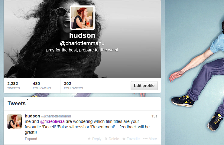
After doing some research we came up with three potential film titles for our film, however we were unsure of which one was the most effective. We decided to get some audience feedback on which one they thought was the best. We posted a tweet asking people for feedback on which was their favourite title. We thought this would be an effective way of getting feedback as it is quick and easy for people to reply and it gets out to all of your followers.
However, after not receiving any responses it was clear that this was not an effective method of getting feedback. I feel this is because of how indirect twitter is, therefore people are unsure whether to respond. The 140 character limit also makes it difficult to fully explain what you want people to do so they do not get the story of the film or anything to link it to.
Therefore, I felt that a more direct approach would work better to get some feedback so text some people to ask. This allowed me to explain in more depth telling them what genre the film is, and also allowing them to give a more in-depth response with a reason why they like that title.
The first person I asked said she liked false witness the best because of the way it makes you question what the film is about.
I also asked Megan Harman, who played 'Louise' in the film, as I thought she would be able to give an informed opinion seeing as she knows the plot of the film and exactly what happens in it. She said that she liked false witness because of the way it is revealed through the film why it is called that. She did also mention that she liked Deceit but it has less relevance to the film whereas False Witness links to it.
The final girl I asked said she liked Deceit because of the fact it sounds like a thriller straight away, however she also said she liked False Witness because it sounded original.
We learned from this feedback to go with the majority, and as all of them mentioned that they liked False Witness we thought it best to go with this. We also learned that an audience like something that intrigues them to watch the film and find out how the title links to it. This was a good way of deciding what to call our film as we know that it would catch our target audience's eye if they were to see it, therefore making them want to watch it.
Feedback on the film I asked some of our target audience questions about our short film to get some feedback and to find out whether we have managed to appeal to our audience and if our product has been successful. I asked the following questions:
1. did you enjoy it and if so, why?
Megan
The points Megan made about the film what that the story line is good and it made her want to watch on. She also commented on the different camera angles making it exciting to watch. This was something that we set out to do, and we feel we have improved by using a range of angles from last year. Megan's comments suggest that we have been successful in using angles to create mood and portray character's in a certain way.
Miya
Miya commented on the way that we showed two different events happening at the same time. This multi-strand narrative is fairly complicated however this shows that our target audience were able to follow it and understood how the different clips were connected to each other.
Sally
Sally also liked the way the we used flashbacks to show Rebecca's lies and give the audience more information (unrestricted narration). She also made a comment about the ending when it is hinted that Rebecca may be out to hurt Louise's mum, we were worried that we had not made that clear enough as there is no dialogue, only a shot of Rebecca standing watching her at the grave. However, this comment suggests that this is hinted which shows that the audience have understood what we were trying to do with the story.
From asking this question I have learnt that our audience like the use of flashbacks as it reveals something to the audience, perhaps they like being omniscient as viewers? The fact that we have targeted the same audience as we did with 'Perception' and we received positive feedback on both about the use of flashbacks tells us that this is a good technique and the overall enjoyment of the film has been successful.
2. does the film deal with issues relevant to you? And as someone of our target audience do you think we have appealed well to you?
Megan
Megan said that the themes of jealousy and peer pressure in the film are what appealed to her as she understood it, showing that these themes are relevant for our audience.
Miya
Miya also commented on the theme of peer pressure showing us that we have successfully planted these themes into the film. She also said that the film appeals to her because the characters are her age.
Sally
Sally said that the issues are relevant to her age group as the characters are their age, therefore the audience may have been through similar experiences to louise e.g. peer pressure to drink.
From this feedback I have learned that we have successfully appealed to our target audience through the issues the film covers which people are able to relate to such as peer pressure. I've also learned that people like to watch films with characters similar to them in (the same age) because they feel they can relate to them more.
3. Did you understand it? Were there any parts that were unclear, if so what are they?
Megan
Megan commented on the grave scenes at the beginning and end of film, saying it was unclear as to whose grave it was and who the character there was. This has been quite a common criticism of the film and a few people have mentioned it. Here are a couple of examples of where other people have pointed this out after sharing the film.
I feel that this misunderstanding is mainly down to the fact we were unable to get someone older to play Louise's mum at short notice as everyone we asked was working an unable to do it. I think our prop of the card on the flowers also played a part in it as it was unclear that flowers were from 'mum' and not to 'mum'. We could have improved this by planning better in advanced allowing us to ask people to act in out film with plenty of time to arrange filming times. This would have allowed us to find an older woman to play the character of Louise's mum to make it more convincing.
We also could have thought more carefully about the prop of the card on the flowers and made it more clear with something like 'To Louise, I miss you, from Mum x'.
Miya
Miya said that she understood it because it is clear and makes you have an automatic response to characters. However, a criticism was that she would like to have seen more about the character's relationship. We could have improved this by thinking more carefully about the flashback shots that we revealed to the audience, perhaps rather than them straight away revealing Rebecca's lies we could have shown them becoming friends first making the audience believe Rebecca's story, and have them become more and more sinister showing the Rebecca is actually guilty which would have created shock for the audience.
Sally
Sally commented on how we could have shown louise becoming more suspicious of Rebecca through the film before she is killed. Although it is hard to fit this into a 5 minute film we could have thought more carefully about our dialogue between the two characters.
Nadine
Again Nadine commented on our use of flashbacks to show the contradicting events and reveal more to the audience. However, she also said that we could have shown a more obvious reason for Rebecca killing her best friend rather than the subtle hints of jealousy. We could have also improved this by thinking more about our dialogue and realising that the audience will not always pick up on things.
From this feedback I have learned the importance of casting and planning things in advanced. If the characters are not convincing it can effect the whole film and confuse the audience. I've also learned that props are a key part to the narrative of a film and they must be very clear and serve a particular purpose in telling the audience something about the characters or story. In addition, I've learned that it is very important to think through your dialogue and plot, especially in a short film as there is a limited amount of time to show everything. Finally, I've learned that although it is good to leave the audience questioning things (why did Rebecca kill Louise?) we must also give them options and hints, which we tried to do showing her being jealous (ruining her top, stealing from her) but perhaps this was too subtle and we needed to make it clearer..
4. did you sympathise with any characters?
I asked this question in order to find out if we have successfully managed to appeal to our audience. From the feedback I have learned that our audience have connected with the characters and are able to sympathise with them. This shows that we have successfully portrayed our characters in the way we wanted as all of them felt they sympathised with Louise because of her innocence and naivety to the situation. However, a way we could improve this is to perhaps challenge the audience's perceptions of characters creating shock, for example we could have made the audience feel slightly sorry for Rebecca being accused of killing her best friend, rather than revealing straight away that she is lying in order to draw the audience in and keep them guessing about characters.
I also wanted to find out what people thought about our camera work and editing, so asked the following question.
How do you feel about the camera work? How could we improve?
Nadine
Nadine suggested that we could have focused more on Rebecca's facial expressions to show her lying. Therefore we could have improved by using more close up/extreme close up shots of Rebecca's face such as this:
an extreme close up of Rebecca from our film showing her sweating.
As this would show the audience that Rebecca is becoming nervous and highlights the fact that she is lying. Nadine also said she wanted to see more of a reaction of the mother at the grave. We chose to not show the mother's emotions too much partly because we wanted to focus the film on the relationship between the girls but also because we did not want to highlight how young our actor was. This again comes back to our preparation in finding an actor which is something that we really struggled with. To improve on this feedback however we could have included a close up of the mother's face as she is standing at the grave showing her crying.
Ana
Ana commented on our camera work and said that although our camera cuts are smooth the audience are jolted around slightly due to our short takes. As Ana suggested we could improve on this by using a wider range of takes making some longer for impact allowing the audience to really focus on what is happening in that shot. for example, reflecting I feel that key moments such as when the mother is at the grave, when Rebecca is lying and when Louise receives the horrible letters we could have used longer takes here to convey the emotions of the characters more. From this feedback I have learned that our audience like to see the emotions of characters to be able to invest in them more, and perhaps because we were trying to fit a complex story into 5 minutes we were unable to convey these emotions properly as we wanted people to focus on the main events of the story.
Youtube has been very helpful in receiving audience feedback. Not only has it allowed us to share the film with people by sending them the link, but it has also given us an indicator of whether people like it, as there is a 'like' and 'dislike' button and we have received 3 likes and 0 dislikes. In addition the number of view (238) is almost double the views that our opening sequence 'Perception' received last year suggesting that this has been more popular.
Has our audience feedback on the film been effective/helpful?
Although our feedback has allowed us to reflect on our overall film and taught us what we could have improved on, I think that we should have been gaining more feedback throughout the process of making our film rather than when we have finished as this would have allowed us to make these improvements along the way and also ensured that our final product fully appealed to our audience through their thoughts and suggestions.
Therefore audience feedback itself is something that I feel we could improve on. Audience feedback is something that is vital for a real commercial product as ultimately if the audience don't like the way the film is going there is no point in making it.
Screen testings are used where members of the film's target audience will watch snippets and comment on what they like and don't like. This has shown it's importance after things like film endings have been completely changed on the basis of the audience's reactions, for example shown here where the audience's opinion has mattered more than the directors.
I feel that perhaps we could have created a few alternative endings to our piece and given the audience a choice of which they prefer. This video shows how one film can have many different endings made and the best one is then chosen:
Poster-
We did many drafts of our poster before arriving at the finished product, and through this product we received audience feedback as to what worked and what didn't. Blogger has been very useful in getting some feedback from our teacher, which helped us with the technical conventions such as alignment and title size to know which two posters to take further and develop.
Draft One
On this draft we received feedback saying that the title does not work at all - it is too small and badly placed as you cannot see it clearly which is the main purpose of a title. However, he did like the way that the two images merged together telling the audience different aspects of the story rather than just showing a main character.
Draft Two
On this draft we received feedback that the alignment needs to be thought about and we would need to either centre everything (the reivew) or justify everything to the left. He also said that we need to think about what we want to tell our audience through the poster.
Draft Three
The feedback on this draft was that the image of Louise on the floor did not work as it looks like she is hanging upside down. In addition we were told that someone like 'Jonathon Ross' was too high profile as it is a low budget short film, therefore we had to think carefully about where we would get our reviews from.
Draft Four
Finally, the feedback on this draft was that the added record button linking it to the film was clever and made it more original. He also commented on perhaps having a tagline.
After thinking about this feedback we decided that we would take these two drafts forward to develop:
We received feedback from our target audience face to face about which they preferred. Most people said they preffered the image of Rebecca on the third draft as she is staring straight into the camera making her look evil and dominating. They also said that having the image where it looks as though both girls are crying is a bit much and doesn't show that Rebecca is the antagonist. We decided to merge these two ideas together, keeping the black background with two images. Therefore we took the image of Rebecca on the third draft and the image of Louise on the second as it makes her look vulnerable but doesn't give away what happens in the film. We also decided to keep the record button as we felt it linked it to the film and made people question what relevance it has.
Final Poster
I also used Facebook to get feedback from our target audience about the effectiveness of our final poster:
Miya said that our use of ratings was effective because it makes it look creditable and makes her want to watch it. She also commented on our use of the Record button on the poster saying that she felt it linked with the film well, this feedback is good as we were slightly worried that people would not understand the link as it is not a huge part of the film.
Sally commented on our image choice saying that this would make her want to find out who is the 'false witness', linking to the title. However, she did comment on the record button saying that she expected the film to incorporate this more perhaps being a home movie but it did not link as much as she thought it would.
Megan said that the record button made her curious as to what it is about. She also commented on the colour palette of the poster saying that the striking colours on the black was effective. However, she said that we could improve by adding more ratings to make it look more creditable and also to fill the dead space.
Nadine said that our choice of image didn't give much away about the story and she felt that another image, such as the mother at the grave, would have been more effective as it gives the audience more of an insight into the story before watching.
Review- We received feedback from our teacher after producing many drafts of the review. This was helpful as it allowed us to see if the review was suitable for the film and the points we were trying to make came across well.
Here is the first draft:
One of the comments made was that we should reference our past feature 'Perception' as they are both quite similar, with the same genre and idea, and 'False Witness' is not a new direction away from this, rather a consolidation and development. Another comment was that we were expecting too much of our film literate audience to understand, so we needed to give a few additional clues and backstory.
Here is our second draft:
One comment was that we should talk about how we constructed the character of Rebecca through acting, lighting, props, editing etc, to come across as an evil and spiteful antagonist. He also pointed out our use of parallel editing to show two conflicting versions of events.
Here is one of our final drafts: The points made here were that there was slight confusion about our casting decisions and how the use of unknown actors has been a good decision, so we cleared this up. A final comment about the last paragraph was that we should note the few issues in the film such as poor casting decisions with the younger actors.
We also used Facebook to ask our audience what they would vote for our film. As LWL reviews contain a rating for Anticipation, Enjoyment and In Retrospect this feedback would help us to decide what ratings we would give it.
After looking at all of the feedback about what rating different people would give the film we came to a conclusion about what we would rate it on the review. For 'Anticipation' the majority said 4, for Enjoyment 3 and In Retrospect 4 so therefore we decided on these ratings.
4. How did you use new media technologies in the construction, and research and planning, and evaluation stages?